PROJECT OVERVIEW
Revamping the existing KFC to improve user experience and incorporate AI functionality.
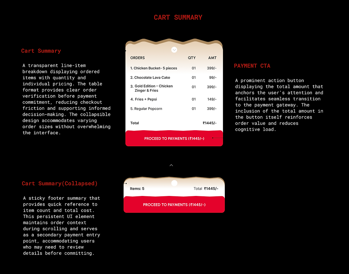
CURRENT SITE PAIN POINTS
-
Displaying categories as dashboard
-
Showing business categories is good idea but not applicable for the FMCG industries.
-
It confuses users where their favourite combination is categorized into.
-
Displaying only categories for entire dashboard conveys one type of information. a thoughtful design thinking help display more information which will helpful for users.
-
KFC runs offers & deals every often which help users to save more on food choices.
-
Having a chat bot or Ai integration would have helped user to order faster and efficiently.
-
Having prominent ‘Start Order’ and location access.
-
Lacks modernization of components & design components.

2. Showing deals above footer
Displaying offers & deals above footer will make users miss them or sometimes aborting the order itself if the order prices are too high.

3. Space for more
Under MENU, displaying items in 3 column will increase scrolling for each menu item too much scrolling will stress user and create order confusions.

DESIGN SOULUTION